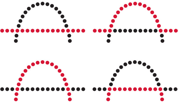
As we reach the culmination of our exploration into the realm of Gestalt design principles, we embark on a journey through the principle of symmetry and order. In this article, we will delve into the profound significance of this principle, its implications for User Experience (UX) and User Interface (UI) design, and how it bestows a sense of balance and harmony upon visual compositions. Join us as we unravel the intricacies of symmetry and order in design, providing a comprehensive understanding of its impact.
Symmetry and Order: An Exploration of Balance
The Gestalt principle of symmetry and order invites us to delve into the world of balance, where equilibrium, harmony, and structured aesthetics reign supreme. It’s a principle that echoes not only in the realms of design but also resonates deeply with our observations of nature.
Symmetry, in essence, is the art of mirroring, a concept ingrained in the very fabric of nature. From the bilateral symmetry of butterflies to the radial symmetry of flowers, nature itself adheres to the principle of symmetry in the most captivating ways. This principle extends its influence to our perception and understanding of the world around us. When we encounter symmetrical patterns in nature, we instinctively recognize them as balanced and harmonious.

In the world of visual design, we borrow from this innate connection with nature to create compositions that echo the same sense of balance. Symmetry isn’t just a design tool; it’s a language that speaks to our primal sense of order and equilibrium.
Consider a serene lake reflecting the surrounding mountains perfectly. The symmetrical reflection in the water not only creates a sense of visual harmony but also offers a feeling of tranquility and balance. This natural symmetry finds its way into our design philosophy as we craft interfaces, layouts, and compositions that aim to evoke similar sensations of order and calm.


Elevating User Experience (UX) Design Through Balance
In the realm of User Experience (UX) design, the principle of symmetry and order plays a pivotal role in shaping user perception and interaction. By employing symmetry, designers can create visual cues that guide users through a seamless and intuitive experience.
Imagine a news website where articles are presented with symmetrical headlines, images, and summaries. The application of symmetry in the layout ensures that users can swiftly locate and engage with articles of interest. The balanced composition conveys a sense of order and professionalism, enhancing the overall user experience. In the context of highly relevant content about a news website, the utilization of symmetrical elements establishes an efficient platform for users to easily access and interact with articles of their interest. The deliberate arrangement evokes a feeling of structure and expertise, ultimately enriching the overall user experience.

Structured Clarity in User Interface (UI) Design
User Interface (UI) design leverages the principle of symmetry and order to establish a structured and aesthetically pleasing interface. Well-organized interfaces offer users a sense of control and clarity, promoting efficient navigation and interaction.
Consider a task management app, where tasks are presented in a symmetrical grid format with consistent spacing and alignment. The use of symmetry instills a sense of order and tidiness, making it easier for users to comprehend their tasks and navigate the interface seamlessly.

Examples of Symmetry and Order in Design
- E-commerce Product Listings: In an e-commerce platform, products are often showcased with symmetrically aligned images, titles, prices, and descriptions. This symmetrical arrangement aids users in comparing products efficiently.
- Calendar Applications: Calendar apps employ symmetry and order to present events, dates, and time slots in an organized manner. A balanced layout enhances users’ ability to plan and manage their schedules effectively.
- Web Navigation Menus: Website navigation menus use symmetry to align menu items horizontally or vertically. This alignment ensures a logical and structured presentation, facilitating easy navigation for users.
- Corporate Branding: Corporate branding materials often adhere to principles of symmetry and order, with balanced logo designs and consistent spacing. This reflects professionalism and reliability.
- Dashboard Interfaces: Dashboards for analytics or data visualization maintain order and symmetry to display information coherently. This enhances data comprehension and decision-making.
Final
Thoughts
As we conclude our exploration of the Gestalt principle of symmetry and order, it becomes evident that the quest for balance and harmony is integral to design. By incorporating principles of symmetry and order, designers communicate a sense of structure, clarity, and professionalism in their creations.
To harness the full potential of this principle, designers must consider the specific needs and expectations of their audience. Striking the right balance between order and creativity allows for the creation of visually elegant and functionally effective designs that resonate with users and leave a lasting impression.


