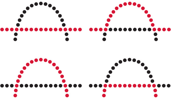
In this exploration, we delve into the Gestalt principle of continuity – an essential element that guides the seamless flow of visual experiences. Join us as we uncover the intricacies of this principle, its impact on User Experience (UX) and User Interface (UI) design, and how it transforms ordinary compositions into captivating narratives.
The Unbroken Thread
The Gestalt principle of continuity, a fundamental concept in visual perception, highlights how our brains naturally follow a seamless and uninterrupted path when interpreting visual elements. It is like embarking on a journey where the pathway remains unbroken, effortlessly guiding us from one point to another. This principle, closely tied to our cognitive processes, enables us to perceive and make sense of the world around us with ease. By recognizing the unbroken flow of visual information, our brains can seamlessly connect different elements, creating a harmonious and cohesive visual experience. Just as a river sets the scene for a tranquil voyage, the principle of continuity allows our minds to navigate through visual stimuli without disruption, enhancing our understanding and appreciation of the interconnectedness of our surroundings.

Guiding User Flows in User Experience (UX) Design
In the realm of User Experience (UX) design, the principle of continuity plays a pivotal role in guiding users through intuitive and enjoyable interactions. By designing interfaces that enable users to follow a clear and unobstructed path, designers create a sense of comfort and understanding.
Imagine a weather forecasting app. The design employs the principle of continuity by arranging the forecast data in a horizontal scroll. As users swipe left or right, the forecast data flows seamlessly, mimicking the natural gesture and enhancing the overall user experience. This smooth transition between screens allows users to effortlessly explore future weather conditions, fostering engagement and satisfaction.

Seamless Transitions in User Interface (UI) Design
In User Interface (UI) design, the principle of continuity shines as a catalyst for creating fluid and cohesive interfaces. Designers strategically employ visual cues to guide users’ eyes and actions, ensuring that the transition from one element to the next feels seamless and intuitive.
Consider a fitness tracking app. The UI design incorporates continuity by visually connecting the user’s progress bar with a graph depicting their workout history. This visual connection creates a sense of unity between these elements, subtly informing users about their journey and progress. As users scroll or navigate through the app, the continuity principle ensures that the flow remains unbroken, enhancing the overall interface usability.
Illustrative Examples of the Continuity Principle
- Smooth Scrolling in Website Navigation: The continuity principle comes to life in website navigation through the use of parallax scrolling. As users scroll down, background images and foreground content move at varying speeds, providing a sense of depth and visual engagement.
- Seamless Slide Transitions in Presentations: In a presentation app, the principle of continuity is leveraged through slide transitions that mimic the flow of a physical book’s pages. This effect adds a touch of elegance and encourages viewers to focus on the content.
- Unified Navigation in E-commerce Platforms: E-commerce platforms often apply continuity by creating consistent navigation elements across product pages. Users can easily navigate through products, add items to the cart, and proceed to checkout, all without interruption.
- Smoother Video Playback Controls: In a video streaming app, the continuity principle guides the placement of playback controls. By keeping controls in a consistent location and maintaining their appearance, users can access and interact with video content without disruptions.
- Seamless Form Progress Indicators: In a multi-step form within a mobile app, continuity is achieved by using a visual progression indicator that maintains a clear path from one step to the next. This approach minimizes confusion and encourages users to complete the form.
Final
Thoughts
Continuity orchestrates a symphony of visual harmony and intuitive experiences. Whether in UX design’s seamless user flows or UI design’s fluid interfaces, continuity plays a vital role in enhancing engagement, usability, and overall design excellence.
As designers, understanding and leveraging the power of continuity allows us to create designs that resonate with users, guiding them on a journey free from interruptions and obstacles.


